Deal with Raster and Projection in R
- Introduction
- Data
- Georectified Raster with Lat-Lon
- Raster Reprojection
- Everything Together
- References
- Update
Introduction
When dealing with data with coordinates, we usually have the longitudes and the latitudes of each data value, and we want to plot the georectified map overlayed with other map layers, or simply we just want to plot the georectified map in a different coordinate system. For example, if you have a data table like below.
> # x for longitudes
> # y for latitudes
> # z for values
> #
> head(xyz)
          x        y        z
1 -152.8786 54.56534 278.4887
2 -152.7311 54.60416 278.3637
3 -152.5835 54.64287 278.2387
4 -152.4358 54.68147 278.1137
5 -152.2878 54.71995 278.1137
6 -152.1398 54.75833 278.1137
And you want to plot the data using a raster with the correct projection. There might be several problems:
- The x and y grids are irregular. It is very common that locations by latitudes and longitudes do not lie perfectly on a regular grid. Some locations are closer to each other and the others are further out.
- The domain of the dataset is not rectangular. In other words, the shape of the domain can be complicate.
- Interpolation method of the whole dataset is not preferred. Interpolation is very time-consuming, and interpolation might bring errors.
After search, I compiled the information online, and recommend the following steps to efficiently create a georectified raster.
Data
You can find the Rdata file here which will be used in this post. The data are subset from North American Mesoscale Forecast Model. You can download the full data by your own option from the NCAR Research Data Archive.
Georectified Raster with Lat-Lon
First, you have the variable xyz. NAM model output has 428 rows and 614 cols, so I hard coded these attributes. We have longitudes, latitudes, and values for each of the grid. Please note that although the grid is regular originally, lat-lon grid is irregular since we want to plot the map in lat-lon.
library(raster)
load('NAM-temperature.Rdata')

# NAM forecast output has 428 rows and 614 columns
nrow <- 428
ncol <- 614

# if you download the original netcdf file
# and use raster to read the variable
# you will get similar results like this
#
dat <- raster(
  xmn = 1, xmx = ncol,
  ymn = 1, ymx = nrow,
  nrows = nrow, ncols = ncol,
  vals = xyz$z)
Let’s take a simple look at the dat which is the temperature in Kelvin and the actual locations of lat-lon points.
library(maps)
library(RColorBrewer) # this is only for color scale
plot(dat, main = 'Temperature Forecasts on 20141231 at 0600',
     col = brewer.pal(11, 'Spectral')[11:1])
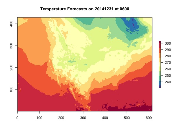
You can see the xs and ys are off, and the shape of America looks weird. What should our domain look like? Let’s plot the coordinates by values.
map()

# plot a sample of the points because this is faster
s <- sample(1:nrow(xyz), 5000)
points(xyz$x[s], xyz$y[s],
       cex = 0.05, pch = 19)
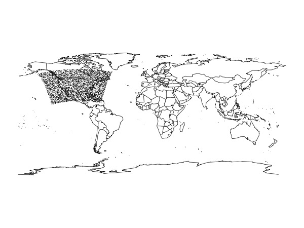
The domain has a bit of a curvature rather than being a perfect rectangle.
Therefore, we are going to do the following steps:
- Get the extent (bounding box) of the domain together with the number of rows and columns.
- Rasterize data with longitudes and latitudes.
- Deal with NA values.
# For color schemes
library(RColorBrewer)

# specify CRS to be used
crs.latlon <- CRS("+proj=longlat +datum=WGS84")

# get nrow and ncol
# this is only an approximation
#
nrow <- dim(dat)[1]
ncol <- dim(dat)[2]

# get extent of the domain
ext <- extent(xyz[, c('x', 'y')])

# create a raster for extent with nrow and ncol
rast <- raster(
  ext, nrow = nrow, ncol = ncol,
  crs = crs.latlon)

# rasterize the data values
rast <- rasterize(
  xyz[, c('x', 'y')], rast,
  xyz[, 'z'], fun=mean)

# you have the map
print(rast)
plot(rast, main = 'Temperature Forecasts on 20141231 at 0600',
     col = brewer.pal(11, 'Spectral')[11:1])
map(col = 'grey', add = T)
map('state', add = T)
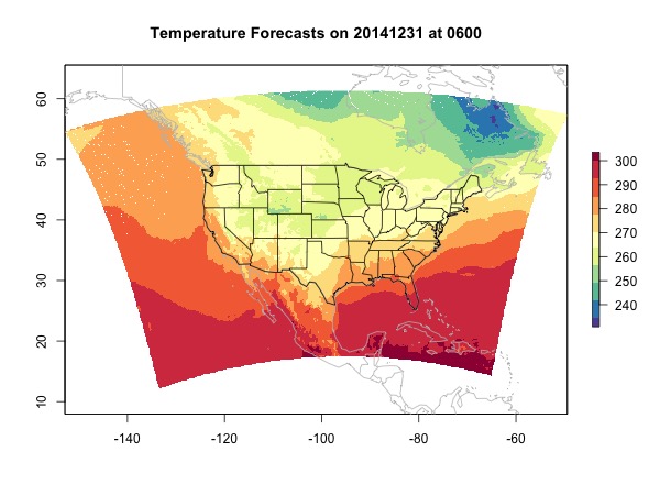
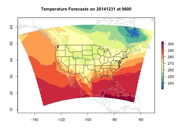
At last we deal with NA values. Popular ways to replace NAs include nearest neighbor and interpolation. If you have multiple raster layers, you can also try to extract values for the NA locations from other layers using the R function raster::approxNA. But this function only works with RasterStack or RasterBrick. As mentioned in the beginning, interpolation is slow and might bring errors. Here, because we are only interpolating for NA locations which should not be too many, we constrain the negative impact. The function provided here only interpolates the NA locations where the up, down, right, and left values are all valid.
source('fill-raster-NA.R')
rast.no.na <- fill.raster.NA(rast)
plot(rast.no.na, main = 'Temperature Forecasts on 20141231 at 0600',
     col = brewer.pal(11, 'Spectral')[11:1])
map(col = 'grey', add = T)
map('state', add = T)
Raster Reprojection
Now that we have a georectified raster, if you want to reproject the raster to a different projection, you can easily do it.
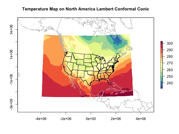
Projection 1: North America Lambert Conformal Conic
I chose this projection because this is the projection used by the NAM model.
When I plot the overlay map, I didn’t use the function maps::map directly because I just couldn’t get it working. If you have an idea please comment. Instead I extract the spatial objects from map and reproject them myself.
# this are the parameters I chose. I had a hard time selecting
# these parameters. See explanations after this code for why
# I chose these parameters.
#
crs.lcc <- CRS("+proj=lcc +lat_1=12.190 +lat_0=40
               +lon_0=-97 +lat_2=45
               +ellps=WGS84 +datum=WGS84 +units=m +no_defs")

# reproject to lcc
rast.ext <- projectExtent(rast.no.na, crs.lcc)
rast.lcc <- projectRaster(rast.no.na, rast.ext)

# overlay
library(sp)
library(maptools)

# extract usa spatial polygons
usa <- map("state", fill = TRUE,
           col="transparent", plot=FALSE)
IDs <- sapply(strsplit(usa$names, ":"), function(x) x[1])
usa <- map2SpatialPolygons(
  usa, IDs=IDs, proj4string=CRS("+proj=longlat +datum=WGS84"))
usa.lcc <- spTransform(usa, CRSobj = crs.lcc)

# extract world spatial polygons
world <- map(fill = TRUE, col="transparent", plot=FALSE)
IDs <- sapply(strsplit(world$names, ":"), function(x) x[1])
world <- map2SpatialPolygons(
  world, IDs=IDs, proj4string=CRS("+proj=longlat +datum=WGS84"))
world.lcc <- spTransform(world, CRSobj = crs.lcc)

# plot them together
plot(rast.lcc, main = 'Temperature Map on North America Lambert Conformal Conic',
     col = brewer.pal(11, 'Spectral')[11:1])
plot(world.lcc, add = T, border = 'grey')
plot(usa.lcc, add = T)
Explanation for the prjoection parameters
- You can get a approximately correct projection from ESRI:102009 North America Lambert Conformal Conic. However you need to fine tune the parameters.
-
+proj=lccis the name of the projection. You can also search the name in EPSG. -
+lat_0=40 +lon_0=-97is the location where you want the projection to be centered. For example, here I chose the center at Penn State. You can find coordinates using Google Map -
+lat_1=12.190is the start of Lambert Conformal projection specified by the model. I found this in NAM modelSpatial Coverage -> Detailed coverage information -> NAM 12km CONUS files. -
+lat_2=45is the curvature of the domain as my understanding. I haven’t looked into this. So please correct me if I’m wrong. -
+ellps=WGS84 +datum=WGS84is the datum used with the projection. -
+units=mis the unit.
I have to admit that finding the correct parameters for a projection is not easy, and I didn’t find good tutorial on this. If you are having the same issue or you have more experience on this, let’s create a general guide for using different projections.
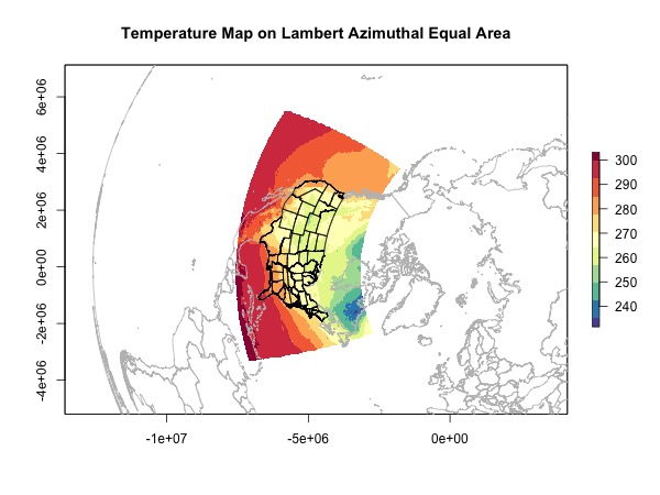
Projection 2: Lambert Azimuthal Equal Area
Now we have the skills, let’s choose a weird projection and try it out.
crs.laea <- CRS("+proj=laea +lat_0=90 +lon_0=0
               +x_0=0 +y_0=0 +ellps=WGS84
               +datum=WGS84 +units=m +no_defs")
rast.ext <- projectExtent(rast.no.na, crs.laea)
rast.laea <- projectRaster(rast.no.na, rast.ext)

# overlay
usa.laea <- spTransform(usa, CRSobj = crs.laea)
world.laea <- spTransform(world, CRSobj = crs.laea)

# jpeg('map-laea.jpeg', width = 600, height = 450)
plot(rast.laea, main = 'Temperature Map on Lambert Azimuthal Equal Area',
     col = brewer.pal(11, 'Spectral')[11:1])
plot(world.laea, add = T, border = 'grey')
plot(usa.laea, add = T)
Everything Together
To put every thing together, you can download the R script here.
References
- ESRI:102009 North America Lambert Conformal Conic
- ESRI:102017 North Pole Lambert Azimuthal Equal Area
- Specifying Grids, Ellipsoids, and Map Projections
- Mapmate R package for 3D latlon visualization
- Overview of coordinate reference systems in R
- Georectification
- maps package R
- How to make raster from irregular point data without interpolation
- Projecting sp objects in R
- Converting a ‘map’ object to a ‘SpatialPolygon’ object
- map2SpatialPolygons: Convert map objects to sp classes
Update
Mar. 25, 2019 Although RColorBrewer schemes are limited by the number of colors in each scheme, you can easily interpolate as many colors as you want using the colors provided and the colorRampPalette function. Note the (100) at the end which specifies the number of colors to generate.
plot(rast, col = colorRampPalette(brewer.pal(11, 'Spectral')[11:1])(100))