ggplot Example 1
- Introduction
- The Grand Template
- Parameter Tunning
- Facetting
- Plotting Rasters
- References
- To Be Continued
Introduction
This is a compilation of R ggplot2 codes to generate various figures that are handy and useful.
More resources and ideas can be found in resources.
Topics that will be covered are as follow:
- Basic plots and elements
- Rasters and spatial objects
- Facetting
The Grand Template
The template for using ggplot functions is:
ggplot(data = <DATA>) +
  <GEOM_FUNCTION>(
    mapping = aes(<MAPPINGS>),
    stat = <STAT>,
    position = <POSITION>
  ) +
  <COORDINATE_FUNCTION> +
  <FACET_FUNCTION>
Please always remember to unpivot, or stack, your data frame, which is usually done by using reshape2::melt function. This post from R bloggers can help make sense of the function.
Parameter Tunning
library(ggplot2)
data(mpg)

p <- ggplot(data = mpg) +

  # Use geom_jitter instead of geom_point to add a small
  # amount to x coordinates to avoid overplotting.
  #
  # Wondering why I chose the shape 16 ?
  # Please read this ...
  # https://r4ds.had.co.nz/data-visualisation.html#fig:shapes
  #
  geom_jitter(mapping = aes(
    x = displ, y = hwy, color = as.factor(year),
    alpha = 0.1), shape = 16, size = 1.5, height = 0) +

  # Define the scale of x and y
  scale_x_continuous(breaks = seq(1, 7.5, by = 0.5)) +
  scale_y_continuous(breaks = seq(10, 45, by = 4)) +

  # Define a different color scheme
  scale_color_brewer(palette = "Set1") +
  # scale_color_manual(values = c('purple', 'red')) +

  # Define x and y axis titles
  labs(x = 'Engine displacement (L)',
       y = quote(miles / gallon)) +

  # Define each element in the legend
  guides(color = guide_legend(reverse = F, title = 'Year'),
         alpha = 'none') +

  # Define the theme first
  theme_bw() +

  # Define the parameters for the theme
  theme(legend.background = element_rect(fill = 'transparent'),
        legend.position = c(0.5, 1),
        legend.justification = 'top',
        legend.direction = 'horizontal')

print(p)
# ggsave('ggnotes-01.png', device = 'png', width = 3.5, height = 3.5)

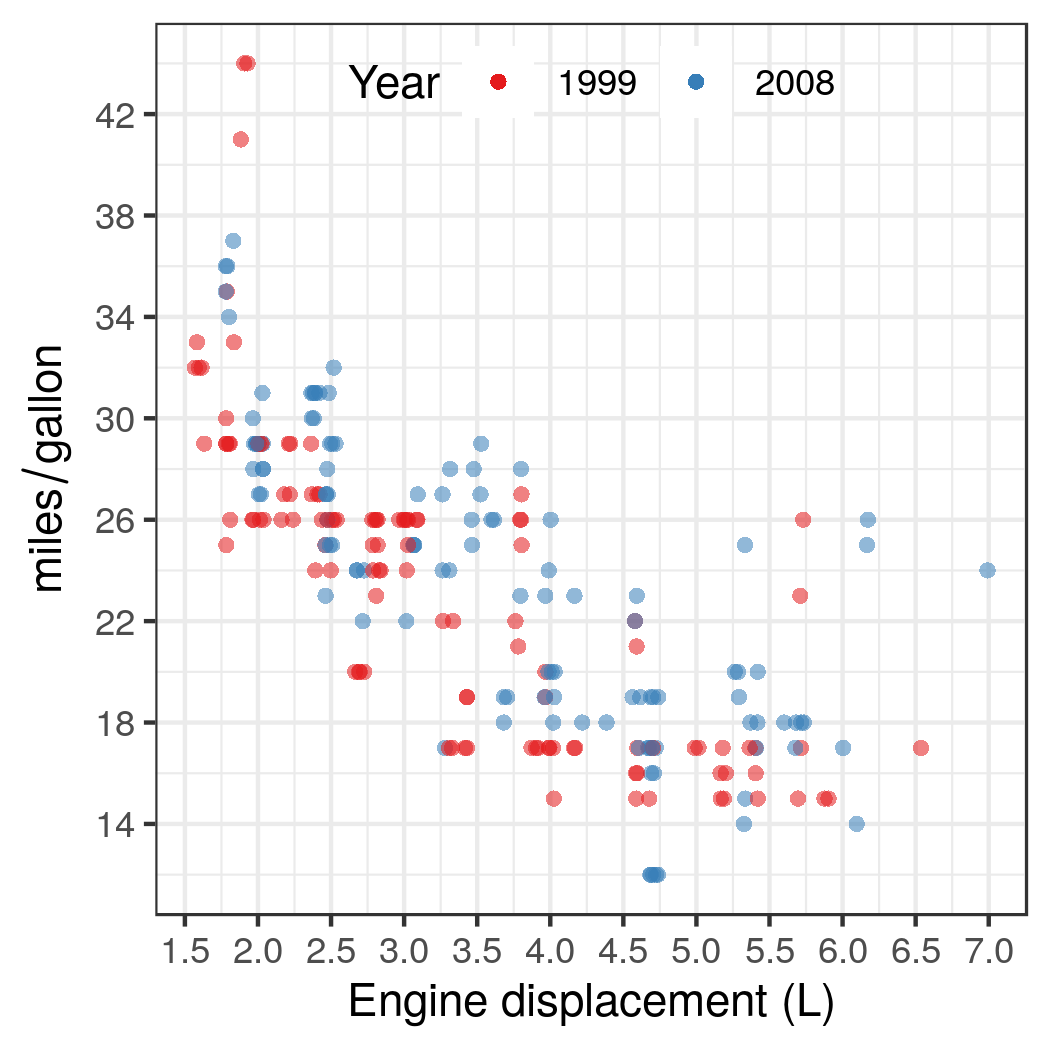
The above snippet of code involves with several topics:
- Adding a small amount to x coordinates to avoid overplotting;
- Changing the x/y axis ticks and titles;
- Changing the color scheme or using a manual setting;
- Modifying attributes and elements of the legend;
- Changing the theme of
ggplot;
Facetting
Native Solutions
ggplot2 supports some simple facetting by using facet_wrap for univariate and facet_grid for bivariate facetting.
p + facet_wrap(~manufacturer, scales = 'free') +
  expand_limits(x = c(1, 10))
But as soon as you are dealing with more complicated facetting problems, like combining different plots or setting different x limits for each subfigure, don’t hesitate to divert to some external packages.
External Packages
cowplot (The Introduction Page) is a very straightforward solution to multi-grid plots with ggplot. Usually a line like the following will just work fine:
plot_grid(ggplot1, ggplot2, labels = c("A", "B"), align = "h")
Use cowplot R package provides some examples to create multi-panel figures.
Plotting Rasters
library(ggplot2)
library(reshape2)
library(cowplot)

#########################
# Create synthetic data #
#########################

# Define x
x <- seq(-5, 8, 0.04)

# Generate from a Gaussian distribution
u <- dnorm(x, mean = 1, sd = 2)

# Generate from a Gamma distribution
v <- dgamma(x, 3)

# Plot to see what they look like
plot(x, u, type = 'l')
lines(x, v, col = 'red')

# The Farlie-Gumbel-Morgenstern family of copula functions
# Referenced from Genest, Christian, and Anne-Catherine Favre.
# "Everything you always wanted to know about copula modeling
# but were afraid to ask." Journal of hydrologic engineering
# 12.4 (2007): 347-368.
#
C <- function (u, v, theta = 0.5) {

  # Value should be a probability
  stopifnot(min(u) >= 0 & max(u) <= 1 &
              min(v) >= 0 & max(v) <= 1)

  # The copula function
  return(u * v + theta * u * v * (1 - u) * (1 - v))
}

# Compute the joint distribution
c <- sapply(u, C, v = v)

# Sanity check
stopifnot(is.matrix(c))

# Create data frames for ggplot
df.univariate <- data.frame(x = x, Gaussian = u, Gamma = v)

df.copula <- expand.grid(x, x)
names(df.copula) <- c('x' , 'y')
df.copula$Copula <- as.vector(c)

# Remove extra variables
rm(C, c, u, v, x)

##################
# Generate plots #
##################

# Generate basic raster plot
p.copula <- ggplot(data = df.copula) +

  # All raster tiles should have the same size
  geom_raster(mapping = aes(x = x, y = y, fill = Copula)) +

  # Change the color scheme by name
  # scale_fill_distiller(palette = 'YlOrBr', direction = 1) +

  # Manually create a new color scheme and set limit
  scale_fill_gradientn(colors = c('blue', 'orange', 'green'),
                       values = c(.1, .5, 1), na.value = 'white') +

  # Change the legend theme
  theme(legend.position = 'bottom', legend.justification="center") +

  # Change the color bar attributes
  guides(fill = guide_colorbar(
    barwidth = grid::unit(0.7, 'npc'),
    title.position = 'right',
    title.vjust = 0.90))

# Define the shared theme for marginal plots
theme.marginal <- theme(
  legend.position="none",

  # Remove extra texts
  axis.line = element_blank(), axis.ticks = element_blank(),
  axis.title.x = element_blank(), axis.title.y = element_blank(),
  axis.text.x = element_blank(), axis.text.y = element_blank())

# Define marginal plots
p.gaussian <- ggplot(data = df.univariate) +
  geom_line(mapping = aes(x = x, y = Gaussian)) +
  coord_flip() +
  annotate("text", x = Inf, y = Inf, label = "Gaussian",
           vjust = 1, hjust = 0, angle = -90) +
  theme.marginal

p.gamma <- ggplot(data = df.univariate) +
  geom_line(mapping = aes(x = x, y = Gamma)) +
  annotate("text", x = min(df.univariate$x),
           y = Inf, label = "Gamma", vjust = 1, hjust = 0) +
  theme.marginal

# You can get legend to manually change it.
# It might be usefull in some cases.
#
# p.copula.legend <- get_legend(p.copula)
# p.copula <- p.copula + theme(legend.position = 'none')

p.combine <- insert_xaxis_grob(p.copula, p.gamma, grid::unit(.15, "null"))
p.combine <- insert_yaxis_grob(p.combine, p.gaussian, grid::unit(.15, "null"))
ggdraw(p.combine)

ggsave('ggnotes-02.png', device = 'png', width = 8, height = 8)

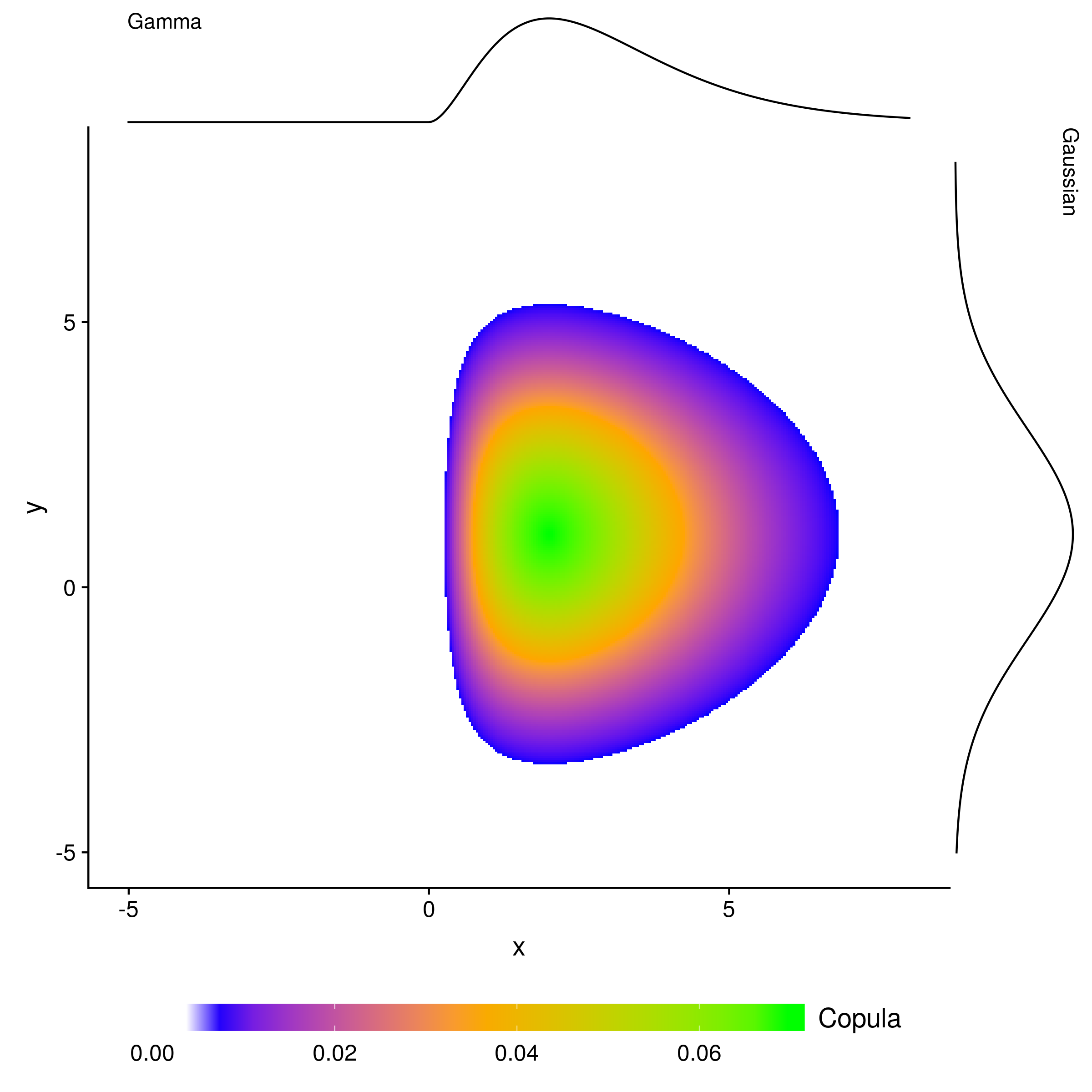
The above codes involve the following topics:
- plotting a raster with uniform tile size;
- changing raster color scale properties;
- Manually creating a new color scheme and set limits;
- adding marginal plots on both axises;
- facetting figure with
cowplot; - Annotating figures;
To plot rasters with ggplot, x and y coordinates should be extracted and each pair should be associated with a value, which compose a 3-column data frame. And then this can be plotted as a raster by using the function geom_raster or its variants which can be found here.
Some helpful resources and tips for cowplot are as follow:
- Shared legends
- Introduction to cowplot
- Arranging plots
- How to change colors automatically and manually
References
To Be Continued
I will update this list if I find other helpful tips. Please comment below if you have any suggestions. Thank you.