ggplot Example 2
Introduction
This is a compilation of R ggplot2 codes to generate various figures that are handy and useful.
More resources and ideas can be found in resources.
Polygons with ggmap
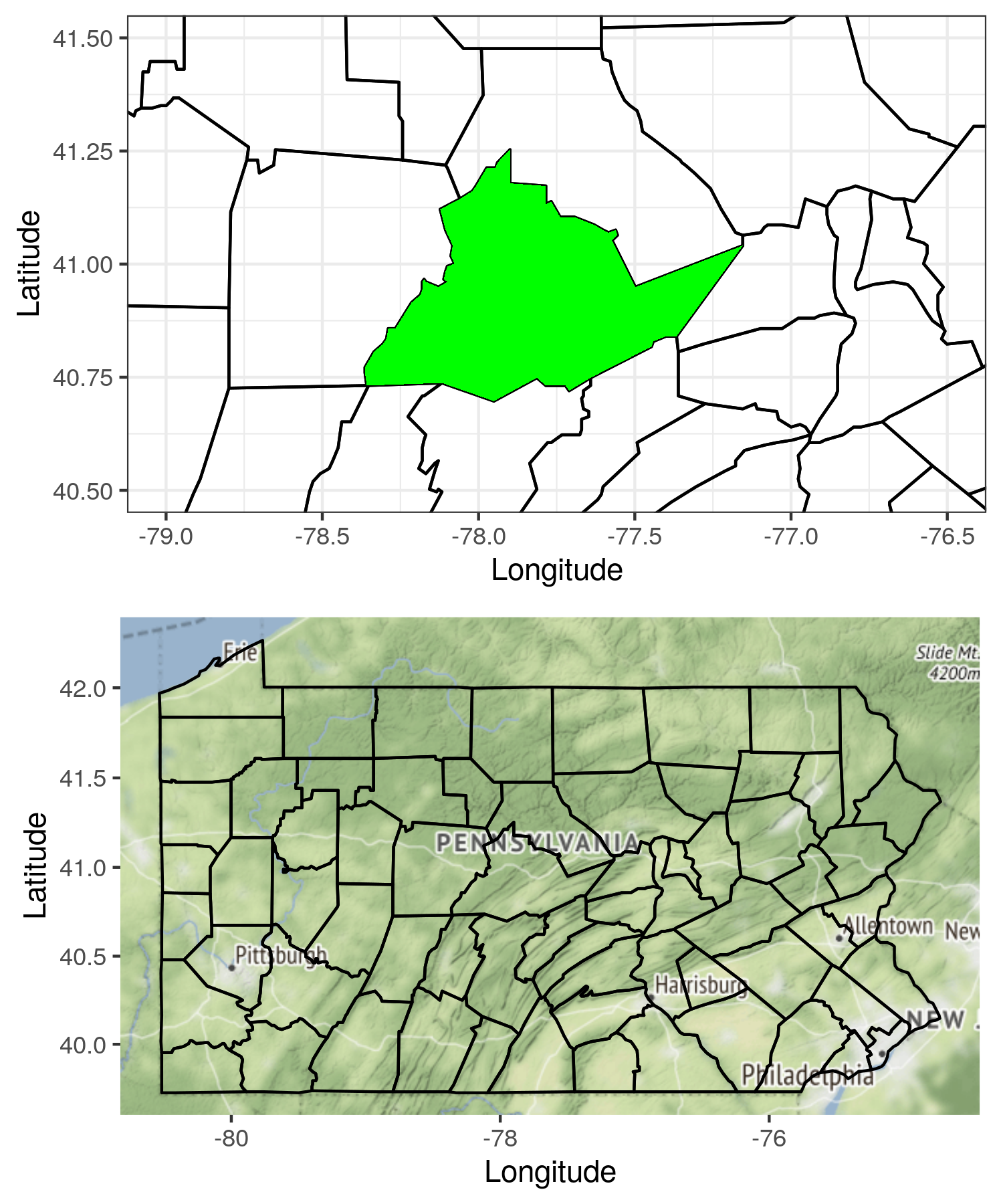
My code for this section is compiled from the tutorial, making maps with ggplot2. This tutorial covers some basic topics I would like to do for mapping with ggplot.
The code covers following topics:
- reading data from the package
maps; - plotting and overlaying polygons and maps;
- setting coordinate ratio and limits;
library(ggplot2)
library(cowplot)
library(ggmap)

# Read data
pa <- map_data('county')

# Subset data to include only Pennsylvania
pa <- subset(pa, region == 'pennsylvania')

p1 <- ggplot(data = pa, mapping = aes(
	x = long, y = lat, group = group)) +

	# Plot the base layer of polygon
	geom_polygon(fill = NA, color = 'black') +

	# Overlay another polygon
	geom_polygon(data = subset(pa, subregion == 'centre'),
							 fill = 'green') +

	# Change axis names
	labs(x = 'Longitude', y = 'Latitude') +

	# Don't plot legend
	guides(fill = 'none') +

	# Set coordinate ratio and limits
	coord_fixed(xlim = c(-79, -76.5), ylim = c(40.5, 41.5), ratio = 1.3) +

	# Use this blank theme from ggmap/cowplot
	# theme_nothing()
	theme_bw()

# Create bounding box
bbox <- make_bbox(lon = pa$long, lat = pa$lat)

# Download maps for the bounding box region
map <- get_map(location = bbox, maptype = 'terrain', source = 'osm', zoom = 7)

# Overlay maps and polygons
p2 <- ggmap(map) + geom_polygon(data = pa, mapping = aes(
	x = long, y = lat, group = group), fill = NA, color = 'black') +
	labs(x = 'Longitude', y = 'Latitude')

# Use the plot function from cowplot to combine multiple ggplot figures
p <- plot_grid(p1, p2, ncol = 1, align = 'h')

print(p)
ggsave('ggnotes-03.png', p, width = 5, height = 6)

North Arrows and Scale Bars
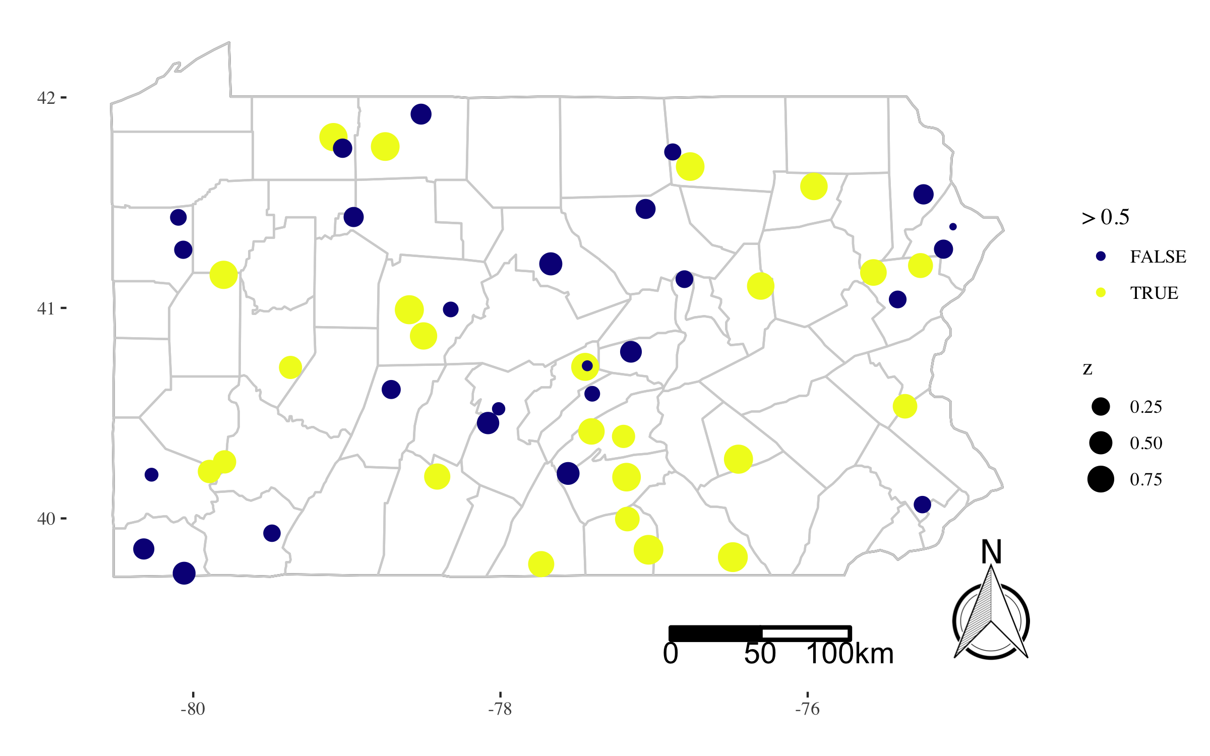
The following code covers:
- how to add a north arrow and a scale bar
- how to enlarge the canvas to avoid overlap
- how to work with basic
sfobjects
library(sp)
library(sf)
library(ggsn)
library(ggplot2)
library(ggthemes)
library(magrittr)

# Get a data frame for PA
pa.state <- map_data('state', region = 'pennsylvania')
pa.county <- map_data('county', region = 'pennsylvania')

# Generate random points within PA and random values
df <- pa.state[, c('long', 'lat')] %>%

  # Convert PA state to SpatialPolygons
  Polygon() %>%

  # Random sample points within the polygon
  spsample(n = 50, type = 'random') %>%

  # Extract coordinates from spatial points
  coordinates() %>%

  # Append the simulated values
  data.frame(z = runif(50))

# We are going to plot the north arrow and
# the scale bar on the map. Since we do not
# want to create overlap between the legend
# and the actual map, we want to increase the
# canvas size a little bit by enlarge the
# boundaing box when ploting.
#
# Get a bounding box from the region of PA
bbox <- c(
  'xmin' = min(pa.state$long),
  'xmax' = max(pa.state$long),
  'ymin' = min(pa.state$lat),
  'ymax' = max(pa.state$lat))

# Extend the bounding box to be taller
bbox['ymin'] <- bbox['ymin'] - 0.4

# I find the functions for the north arrow
# and the scale bare work better with sf.
# So convert the bounding box to sf.
#
bbox.sf <- bbox %>%

  # Convert the vector to a matrix
  matrix(ncol = 2) %>%

  # Convert the matrix to multipoint
  st_multipoint() %>%

  # Convert to sfc with EPSG code 4326 which is
  # proj4string: +proj=longlat +datum=WGS84
  #
  st_sfc(crs = 4326) %>%

  # Convert to sf
  st_sf()

# Define the anchor points for legends
anchor.north <- c(bbox['xmax'] + 0.5, bbox['ymin'])
anchor.bar <- c(bbox['xmax'] - 1, bbox['ymin'] + 0.1)

# Change the names of the vector members
# to what the ggsn expect.
#
names(anchor.north) <-
  names(anchor.bar) <-
  c('x', 'y')

p <- ggplot() +

  # Add the polygon layer for state boundary
  geom_polygon(
    data = pa.state, fill = NA, color = 'black',
    mapping = aes(x = long, y = lat, group = group)) +

  # Add the polygon layer for county boundary
  geom_polygon(
    data = pa.county, fill = NA, color = 'lightgrey',
    mapping = aes(x = long, y = lat, group = group)) +

  # Add scatter points with sizes and colors
  geom_point(
    data = df, mapping = aes(
      x = x, y = y, size = z, color = z > 0.5)) +

  # Choose a color scheme
  scale_color_viridis_d(
    name = '', option = "plasma") +

  # Enlarge the canvas by using a manually set ylim
  coord_cartesian(ylim = bbox[c('ymin', 'ymax')]) +

  # Create the north arrow within the enlarged canvas
  north(bbox.sf, location = 'bottomright',
        scale = 0.2, anchor = anchor.north) +

  # Create the scale bar within the enlarged canvas
  scalebar(bbox.sf, dist = 50, dist_unit = "km",
           transform = TRUE, model = "WGS84",
           anchor = anchor.bar) +

  # Choose map theme
  theme_tufte() +

  # Remove x and y labels
  labs(x = '', y = '') +

  # Change the legend names
  guides(color = guide_legend(title = '> 0.5'))

print(p)
# ggsave(file = 'ggnotes-04.png', width = 8, height = 5)

References
To Be Continued
I will update this list if I find other helpful tips. Please comment below if you have any suggestions. Thank you.